Colors play a vital role in the design and everyday life and they are the reason why color theory even exists. Color can make us feel a certain way when we see it depending on whether we like that particular color or not. We can also associate memories and thoughts with certain colors. It is a powerful communication tool and can be used to signal action, influence mood, and even influence physiological reactions. Certain colors have been associated with increased blood pressure, increased metabolism, and eyestrain. Designers have long believed that color can dramatically affect feelings, emotions, and choices we make. So, you can imagine how many times during the day we do something because of the colors that affected us at that particular moment.
What is color theory?
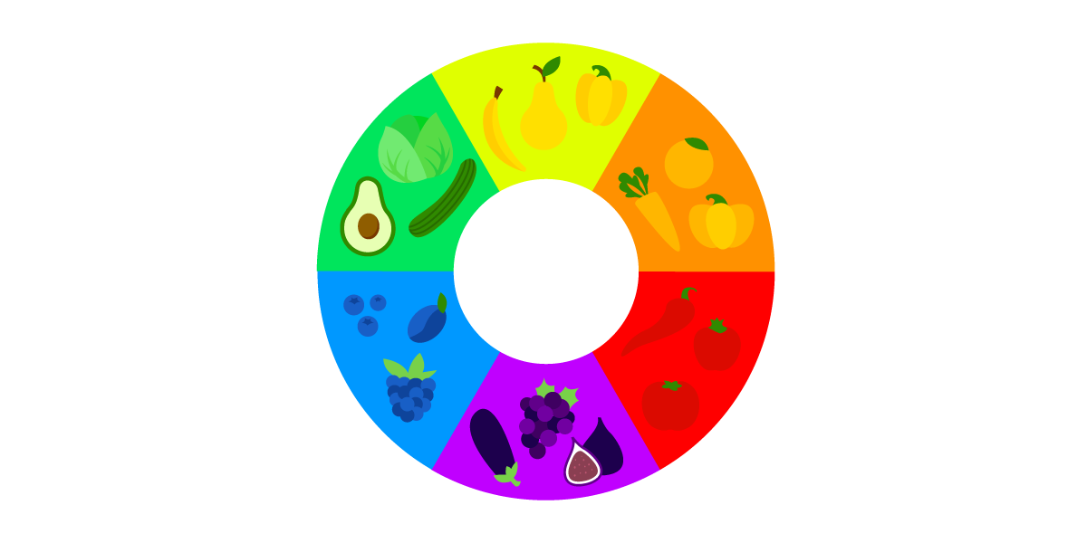
Color theory is a science and art unto itself, which some build entire careers on, as color consultants or sometimes brand consultants. Color theories create a logical structure for color. For example, if we have an assortment of fruits and vegetables, we can arrange them by color and place them on a circle that shows the color relation between them. Then we will end up with a color wheel built out of fruits and vegetables. But what is a color wheel? The color wheel is a compound of primary, secondary, and tertiary colors and even more shades in between them. There are two types of the color wheel. The RYB or red, yellow, and blue color wheel is typically used by artists, as it helps with combining paint colors. Then there is the RGB, or red, green, and blue color wheel, which is designed for online use, as it refers to mixing light – like on a computer or TV screen. When we choose different colors in our design, the color wheel is a great way to understand the color harmony and how colors work together.
There are four qualities for each color in the color wheel. The hue is the brightest and most vibrant version of each color in the wheel. This color is determined by its position on the wheel. Then we have the saturation which is also known as intensity or chroma and it tells us how vibrant the color is. Desaturated color is dull and grey while a saturated color is vibrant and strong. Then we have a value of a color which tells us how light or dark a color is. We can get shades of that color by adding black, tints by adding white, and tones by adding grey. And last we have the temperature of the color. The color wheel can be split into two main groups, warm colors, and cool colors. Each color can be placed in the warm group of colors or cool group of colors.
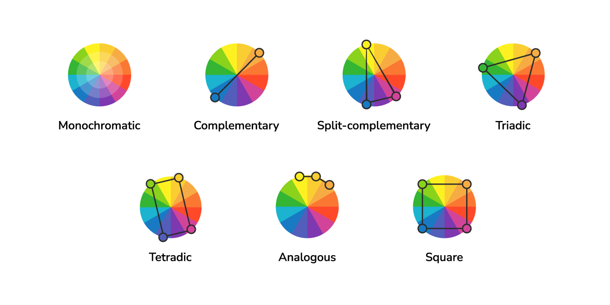
Along with some easy-to-follow formulas, we can create color combinations that look appealing and just work together. These combinations of colors are called color harmonies or color schemes, but how are they created?
The easiest of all is the monochromatic color scheme. This takes just one base color from which we can add different kinds of shades, tints, or tones out of that one color we chose to create a group of colors. With this method, you will get a simple, organized, and cohesive look and feel.
Then we have a complementary color scheme that contains two colors that have opposite positions on the color wheel. For example, red and green, blue and orange, or purple and yellow. This type of color harmony is great if you want to have a strong contrast in your design.
The split-complementary is similar to the complementary scheme except one of the colors is split into two nearby colors. This keeps the strong contrast between the colors but also adds more variety. Beginner artists and graphic designers often gravitate toward these types of combinations as they start to branch out into more complex color schemes since they’re approachable and intuitive.
A triadic color scheme uses three different colors evenly spaced around the color wheel like a triangle. They are very versatile and create a vibrant, bold color palette. Still, they tend to be easier on the eye than a simple complimentary pair, making them a pretty safe bet if you want more than one hue to play with.
The tetradic color scheme has four different colors made up of two sets and placed around the color wheel in a rectangle shape. These palettes work best if you focus on one color and make it a primary color, and then use the rest of the colors as contrasting accents.
The analogous scheme uses two to four colors that are next to each other on the color wheel. This works best if you choose one dominant color and other colors as accents. When using an analogous color scheme, stick to the 60-30-10 rule to maintain a visually appealing balance. Also, stick to warm or cool colors because your design will give a sense of harmony by using only one color temperature.
Then the last one is the square color scheme which consists of four colors spaced evenly around the color wheel. To create a square color palette, pick the key color to start with and then identify the other colors that are equidistant from that color. You’ll end up with two complementary pairs. This scheme is less common than some other color combinations because there’s a lot of contrast built into the hue choices.
Color psychology – How can colors have such an impact on us?
While perceptions of color are somewhat subjective, some color effects have universal meaning. For example, how would you feel going to sleep in a bedroom filled with pale, neutral colors? Would a room painted with purple walls make you feel more or less relaxed? In the world of design, are you more inclined to click on a green button or a red one? Did color play a part in the last item of clothing you purchased? Answers may indeed differ from person to person, depending on factors like culture, gender, age, and more. However, some color meanings are more universal. For example, we naturally relate warm colors like red, orange, and yellow to warmth and sunlight, whereas cool colors like blue, green, and purple tend to be soothing and refreshing. So have you ever been aware that you made a certain choice due to a specific color? If so, then you understand how much colors can affect even the smallest decisions in our life.
This natural connection we hold between color and emotion determines many of our decisions daily, from which brand of toothpaste we’re drawn to at the supermarket, to our choice of color for our home interiors. People decide whether or not they like a product in 90 seconds or less. 90% of that decision is based solely on color. So, a very important part of branding must focus on color. While an individual’s response to color can stem from personal experience, the science of color along with color psychology supports the idea there’s far more to it.
Color meanings
While each color can be used in a never-ending range of shades, tints, and tones, the psychology of color has defined guidelines that can help with your palette choices.
Warm colors
This includes red, yellow, and orange, and variations like pink. These colors evoke warmth due to their brightness and link to the sun. In general, they convey optimism, enthusiasm, and passion but can also be a symbol of rage and hostility.
Cool colors
These include green, blue, purple, and their variations like violet. These colors are considered cool as they are colors commonly found in nature and are known for their calming effect. These colors are soothing, relaxing, and subdued but can sometimes be a representation of sadness.
Neutral colors
These include brown, black and white, as well as variations like gray. They’re often paired with warm or cool colors but are sophisticated on their own. They can be powerful and pure and are sometimes referred to as the earth tones. These colors are the epitome of nature and can represent anything from peace and calm to wholesomeness and reliability or even boredom.
So how to make better color choices?
Use color harmonies
Color harmony refers to the property that certain aesthetically pleasing color combinations have. These combinations create pleasing contrasts and balances that are said to be harmonious. These combinations can be of complementary colors, split-complementary colors, color triads, and more. All they do is describe the relationship between where these colors are on the color wheel. Color harmony has been a topic of extensive study throughout history and is often used in the design world to achieve certain moods or aesthetics.
Don’t forget the neutral colors
The most common neutral colors are blacks, whites, greys, and browns. So their most notable trait is that you can’t tell what their underlying color is, and the benefit of using neutrals is that they give you relief from your primary color. For example, if you are using a bold bright primary color with the neutrals, then you will achieve harmony in your color palette and the primary color would stand out even more.
Less is more
The most common mistake that most designers do is they use too many bold-bright colors, but the more colors you use the more difficult it becomes for them to work together. Think of it as the lunch you are cooking, you don’t use all the spices you have in the kitchen for that one lunch because it will just become a big mess. So it’s pretty much the same with our design. We want to use just certain colors to achieve a specific mood and aesthetic. My advice here is to start with just one or two bright colors and a few neutrals because you can always add more colors later.
Pay attention to the contrast
When you are creating your design you always want to keep in mind how it would look in grayscale because later on, it will determine how it will look in a full-color palette. The contrast is more important than the colors themselves because without enough light and dark contrast your design will be lost. Also, without contrast, you will make something difficult to see or read and it can render your message illegible or even invisible to people with color blindness. My rule here is “if it works in grayscale then it will work even better in a full-color palette”.
Strive for balance
Imagine your colors are musical tones. You want to make sure there’s a nice range of values, hues, and saturation when you are selecting colors for your design. It’s all about the relationship between the colors you use. That means you can’t have a dark color without a light color and everything else in between. Let one or two colors take the lead and be the primary colors and then have the rest colors keep the rhythm with them. The 60-30-10 rule is a good place to start: you will use your primary color 60% of the time, your neutrals 30%, and have a 10% for the accent colors.
Experiment and find your own rules
Despite what you have learned so far, you already know that you don’t need to follow all the rules strictly. You can always follow the rules you have learned throughout your career and adapt them to your working method. Projects you work on will always differ from one another and will require a different approach to them as well, so in that case, you will be the one who will decide how to work with them. Feel free to experiment and even break the rules if you think that will work out even better. And if it didn’t work out better then you have learned a lesson and gained even more experience.

Matea is a UX/UI designer at FarShore. She always loved everything that was nicely designed, so that was one of the reasons why she even started to learn designs and started a career in that area. When she’s not working you can find her somewhere outside enjoying the sunshine.