As a web designer, working on designs for an e-commerce site is always a challenge. On the one hand, you want your designs to look great, and you want to bring something new and exciting to each project. On the other, there are several rules you have to follow and there is only so much invention you can bring to the table, since in the end, the only measures of a site’s success are conversion rates and sales.
So how does term “beautiful” fit into a quality and functional e-commerce site? In e-commerce, the term “beautiful” should be defined by both user experience and style. When someone says: “Look at this site, it’s great, I just bought this product and it went so smoothly!” we can say that the site is successful. What does this mean for a web designer or a UI/UX designer? Let’s see what steps to take to achieve a beautiful and functional e-commerce site.
Type of e-commerce store
There is a difference in approach between multi-product e-commerce sites and single-product e-commerce sites. Single-product sites are often one page sites and have simple information architecture, even when they have more than one page. Multi-page sites have complex information architecture and organizing these pages can be a painful task, which if not done right will lead to inconsistency, untrustworthiness, and overall a bad user experience. But no matter what type of e-commerce site you’re designing, all sites should have common key elements.
Key elements for a successful online store
CONTENT
Design should be built around content, not the other way around. Mostly designers work with dummy text because content is not written yet, or the client wants to see the designs first and then decide about the content. This can result in situations where there’s too much content for certain sections, the volume of the content doesn’t fit the design, or the structure has to change completely. Before starting the wireframes and design, we need to think about the content, only then can good user experience be applied and we can have meaningful navigation, content boxes, etc.
IMAGES
On e-commerce sites, images are probably the most important elements, because a good image helps make the sale. That is why it’s so important to have quality images on the homepage, category page, and most important, on product pages. If you are selling a virtual product, make sure you have a lot of screenshots. If you’re selling a physical product, show images of the product from all angles and images of the product in use (users often want to “buy” a certain lifestyle.) Use big images and close-up mechanisms. Below are examples of how Amazon and eBay do it.
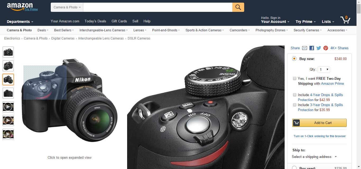
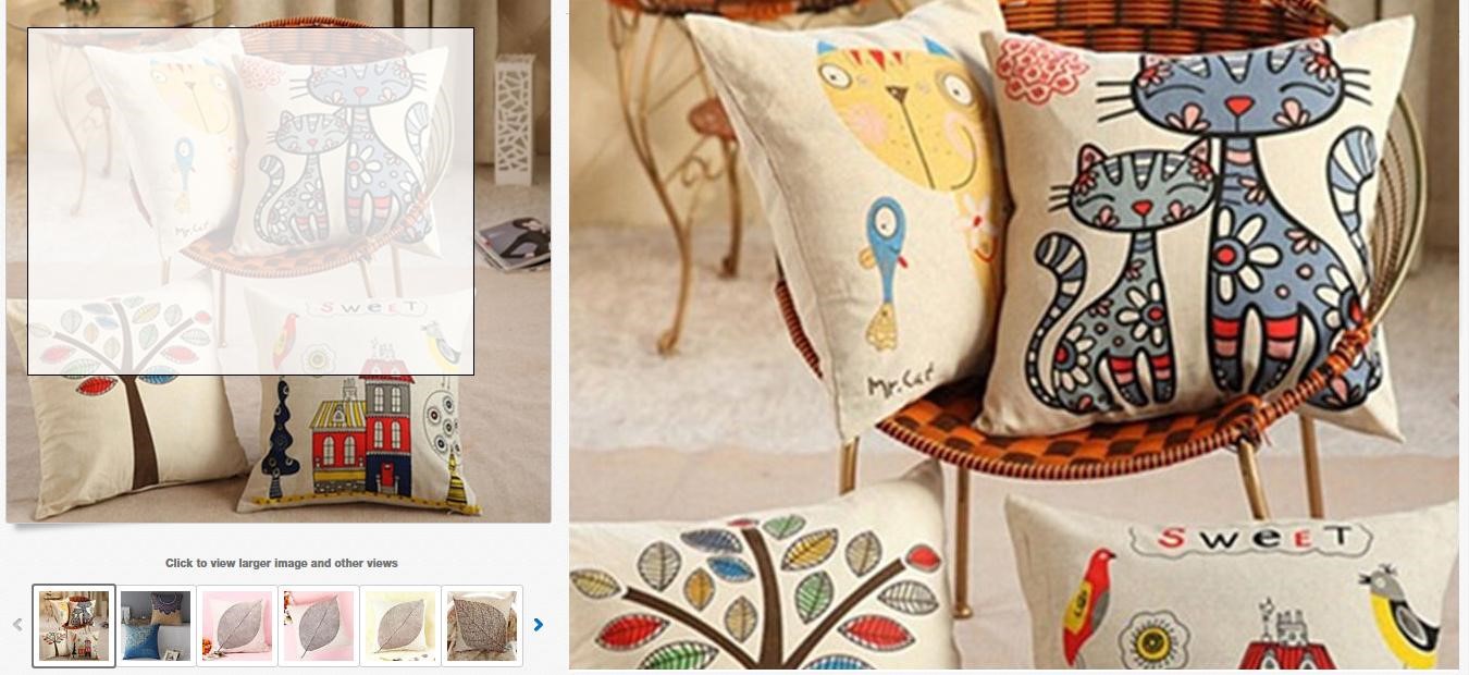
Large images help make better sales, so use them whenever possible. The only issue that might arise with big images is slow loading speed, so images need to be optimized for web and mobile.
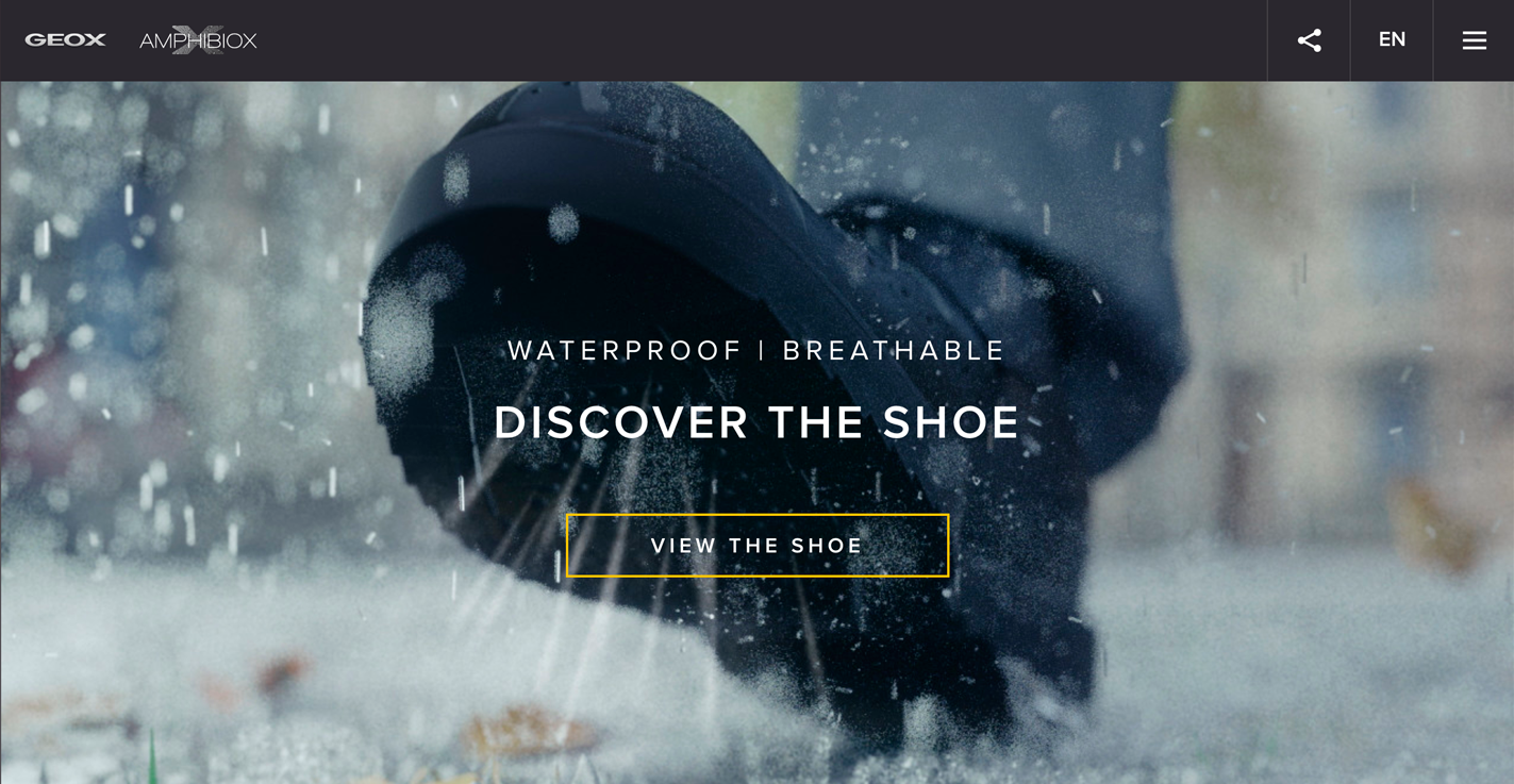
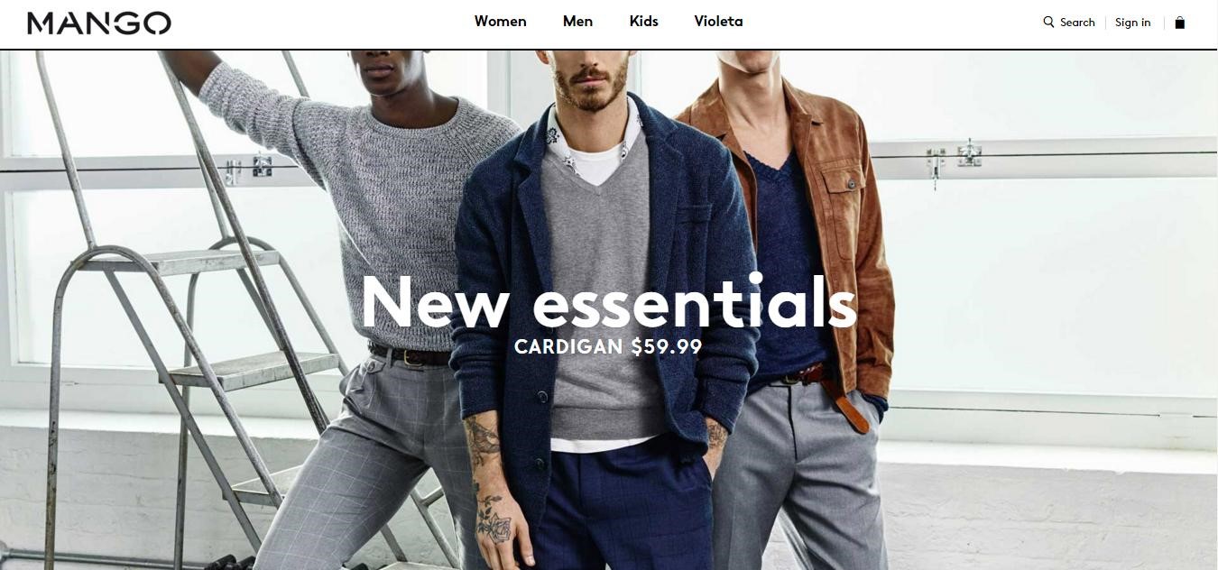
Aside from product images, large images are used on other places on the site, such as full width backgrounds. With popular minimal design, there is not much space for a website to stand out. By using a quality photograph that presents a certain message, story and brand, a company can easily convey to a user/customer what they are about. Nothing “sells” a product like the promise of a certain lifestyle that goes with that product/brand, and large lifestyle images show a customer how he or she can be a part of that. Not to mention that large images draw attention, especially when combined with large text.
TYPOGRAPHY
Web safe fonts are long gone, and custom fonts are all over the web. How to easily relay a message and look unique while doing it? Use a big and interesting font! Below are some sites that use big headline fonts over an image.
When we discuss the typography used over your entire website, different rules must apply to body copy and to big headline fonts. With typography you communicate with the user/customer and selecting the right font will impact the entire look and feel of the website. When choosing the right font or typeface, consider legibility and readability. Just because you like some font or the font is defined by company brand guidelines (that are made for print materials and therefore different font rules apply), don’t use that font if it doesn’t satisfy the basic rules of the web. Also consider your audience and what you are selling. The choice of a font changes depending on the product, because the product sets the tone. For example, a fashion website and an online store that sells equipment for hospitals will have different typography choices.
COMMON E-COMMERCE ELEMENTS
When designing an e-commerce website, there are common elements that every online store needs. By making these elements look right, putting them in the right place, and keeping them simple enough from a user perspective, you are improving the experience of your customers.
- Navigation & Search
Navigation organization is very important for each online store. When users can’t find what they are looking for, they get frustrated. Make sure that you categorize the products, that you have a visible cart, that you use breadcrumbs, and above all, that you have very noticeable search functionality. Some online stores with a large inventory have a search bar that dominates the header. To demonstrate how search is important to online stores, just look at dynamic search bars that are becoming more and more popular. Try to find something on this site; so fast and easy, right? ☺
Furthermore, the auto-complete feature allows users to type only a few letters and be presented with a number of options. This can be used to showcase related featured products, but make sure you label them as suggestions and not search results. Other very important elements connected with search that shouldn’t be overlooked are filters. Users should be able to refine their search, or change their mind in what they are looking for while narrowing down the search, without having to click on the Back button.
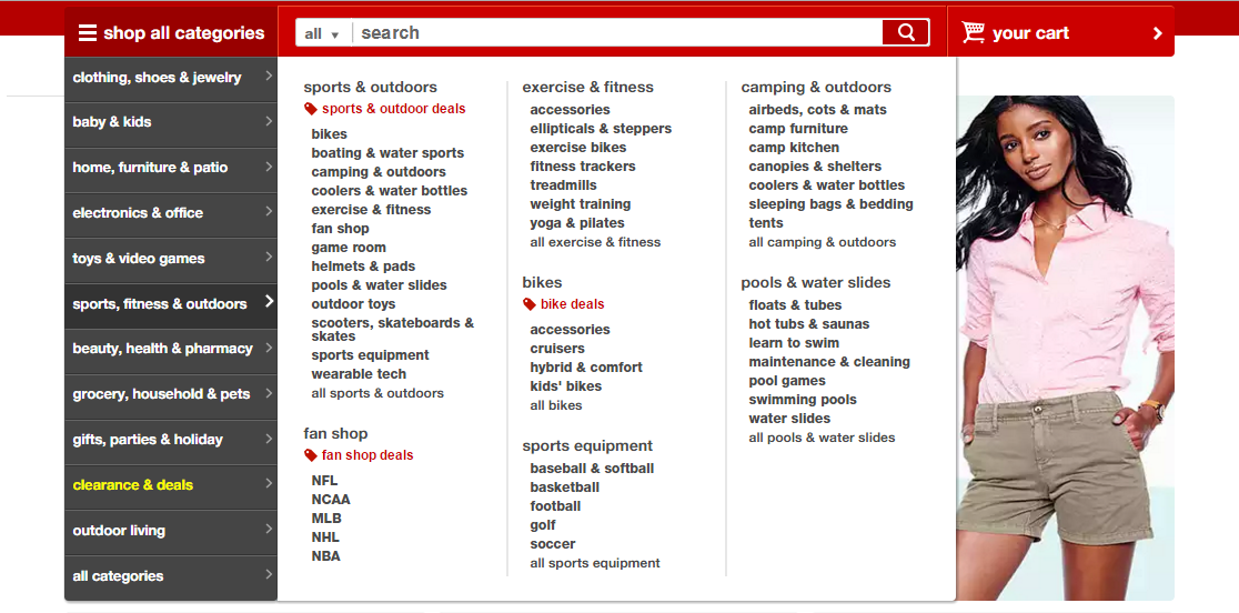
Example of an organized mega menu with clickable main/parent categories.
- Related products
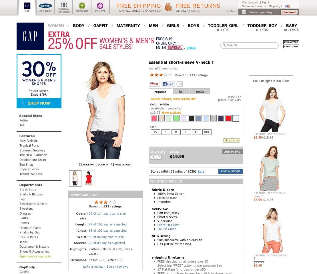
Related products help users find similar products that he/she might be interested in. Giving suggestions to the users also gives the store the opportunity to display products the user might not stumble upon, and therefore generate more sales. Make sure related products are prominent on the page, commonly they are under the main product description.
Example of a clean product page with related products.
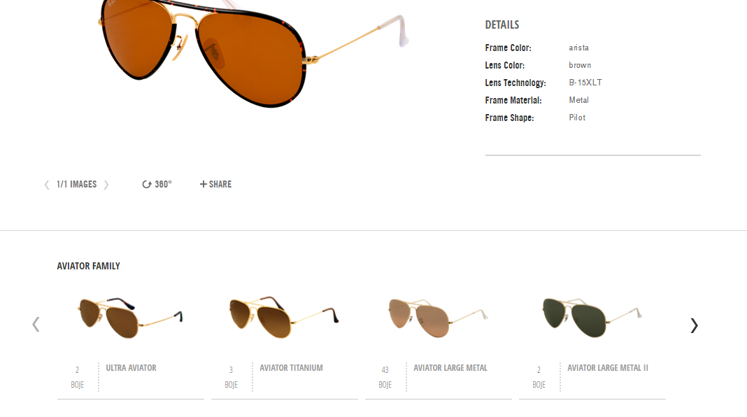
- Product descriptions
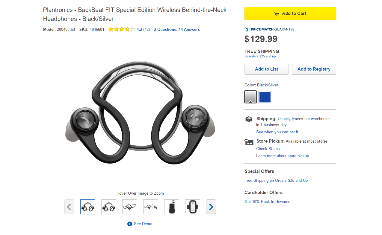
Product information needs to be detailed; if you’re selling clothes, make sure you include sizes and a size chart, available colors, information about fabric, care instructions and a product description using descriptive, rather than technical terms.
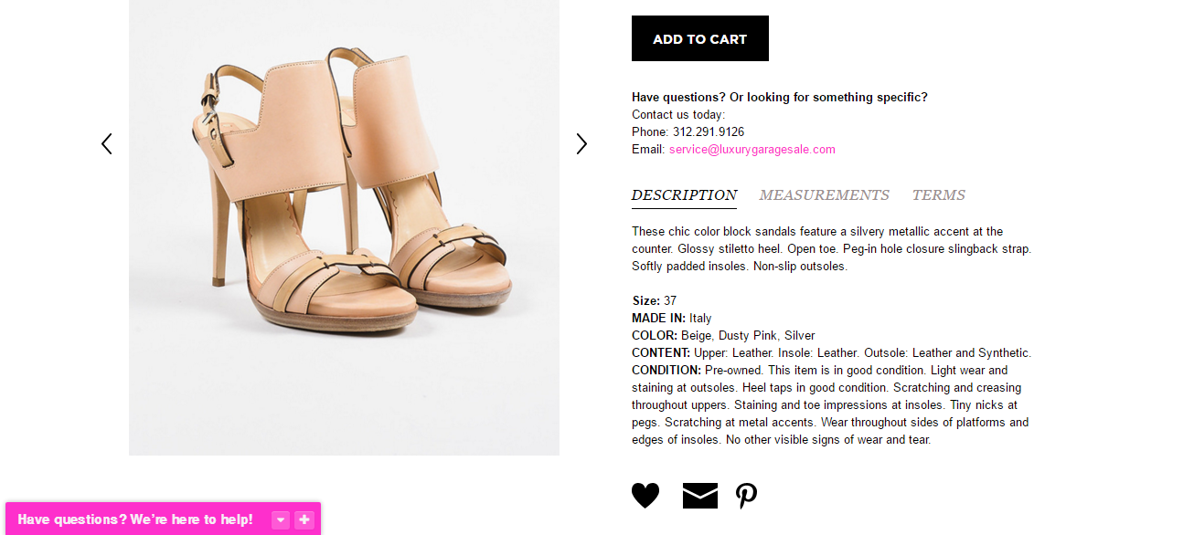
Example of detailed product information.
- Ratings and reviews
Ratings and reviews give trustworthiness and credibility to your products and service. Users won’t believe in a product until they have a confirmation from another independent user. With good reviews, you will gain loyal customers and more repeating sales. Positive reviews will motivate the user, but what about negative feedback? Use it to make your product and service better; by answering users’ concerns about your product, you can publicly show your support and customer care.
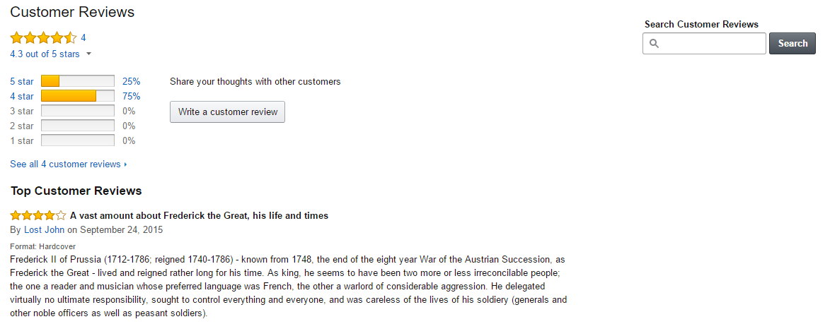
Example how Amazon displays ratings and reviews.
- Sharing
Social media can play a big part in your SEO, popularity and sales, so think twice before just placing social buttons somewhere on your site. They shouldn’t dominate the site, but need to be visible to the user. If user needs to search for them, they are probably useless. Buttons should be implemented on the product pages and on the “thank you” page after the user makes the purchase.
Example of a product page with social buttons that are easy to miss.
- Contact and support
Trustworthiness and transparency can be achieved by prominently displaying your contact information, privacy policy, terms, FAQ, shipping and returns. Make sure it is easy to find. Users will trust you more if they see that behind the e-commerce site is a real company and real people that they can call.
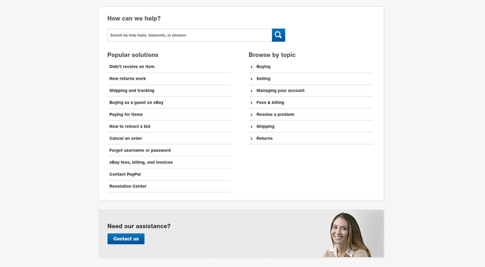
Example of an extensive support page.
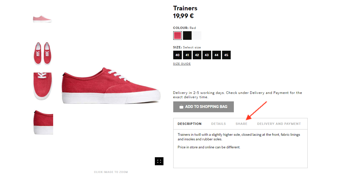
- Call to action
This is one of the most important elements of the site. Actions like “add to cart”, “buy now” and “buy with one click” need to be effective;make it visible and attractive!
Example of visible CTA buttons on a product page.
Example of a product page with CTA buttons that are hard to notice. You have to look twice to find “Add to bag” button.
- Checkout process
Checkout is the part where many users just give up. The reasons for that can be multiple. To ensure a seamless checkout process, make it simple, add steps or progress bars as indicators and make sure there are a reasonable number of steps, make forms consistent and understandable and group them to appear simpler and shorter, and display a summary and confirmation page. Ensure good speed and don’t force users to register; allow guest checkout.
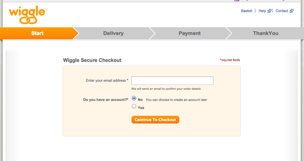
Example of visible checkout steps indicator and ability for a customer to checkout as a guest.
Following design trends
Now that you know where to start and what to include, let’s take a look at some of the trends in e-commerce design. Material design, cards (thank Pinterest for that) and minimalism are dominating the design world these days. They have their ups and downs, but what they have in common is optimization for all types of devices and screen sizes, and this is good not only for mobile but for large screens as well.
Many users have screens above 1920px so it’s important to be focused on larger screens as well as on mobile screens. Designers have certainly used big screens to their advantage; just take a look at the chapter on big images and typography and you’ll see how full page background images dominate e-commerce websites. Check out some of the awwwards.com winners in the e-commerce category here.
The future of e-commerce design
So what to expect in the future? Are all websites going to look alike, and is that necessarily a bad thing? Following UI patterns and trends leaves little room for innovation, but it ensures a common user experience, as the user is already familiar with the patterns and will more easily navigate through a certain website. As material design and cards continue to be a trend, we can expect more interesting product images, lifestyle images and storytelling, playful colors and whitespace, animations for a more playful shopping experience, motion animation and long scroll. I am excited to see where all this goes and what new innovations we web designers can bring to the table for a better and more engaged online shopping experience.
Want to reach out and ask us something related to design for ecommerce? Or are you maybe interested in getting your own web store with unique look? Contact us and our web designers will be happy to help you out!
Lucija is FarShore’s Team Lead, managing team’s daily tasks and working on UI designs for all types of projects. Her interest in UI/UX, graphic communication and illustration has been evolving ever since the beginning of her secondary education at School of Applied Arts and Design. As a culmination of this interest, in March 2012 Lucija obtained Master degree in graphic technology at the Faculty of Graphic Arts in Zagreb.