Why consistency matters
Consistent design is a popular topic in the design community, but it is often misunderstood. At FarShore, we look at design consistency as an experience. And in an effort to provide a quality experience to users, it’s necessary to be consistent in user interface, messaging, and content across a brand’s mediums (website, iOS or Android application), communication (social, email), and even offline (offices, marketing materials). This consistent representation enables a user to recognize elements and anticipate the next action thereby speeding up the learning curve for new products and services that a user has yet to explore. This predictability and trust allows brands to engage and transact (see: Amazon’s color coding of affirmative buttons) users faster. If a user does not trust the system, it will lead to stumbling, confusion and frustration.
So in what areas can you be consistent to avoid user frustration and to get the best user experience? Elements of the design should be consistent, as should the interaction and content. The content should be consistent in tone, mood, quality, and quantity. For example, if the design of the site is funny and relaxed then content should reflect that. How can you make sure you are being consistent throughout your website and/or your mobile application, especially if you are dealing with someone who doesn’t understand your company’s culture and brand?

Brand guidelines are a starting point
Brand guidelines or visual identity books have been around for quite a while. Even before the days of the web, companies needed to create consistent and unified visuals for their brand. Brand guidelines are usually set out in a document and contain information such as brand colors, typography (fonts, sizes, leading etc.), logo positioning and how to use the logo in different situations, brand assets, the mission statement, tone of voice etc. Brand/ identity content varies based on the company type and can be a single page document or an exhaustive brand book. But the intent is universal; brand guidelines provide the architecture for brand and visual identity to power organizations.
So if brand guidelines are so comprehensive, what are style guides? Style guides are usually more of an internal document meant for designers and developers, they work in a similar way as brand/ identity guidelines, the only difference being that you’re not creating an identity for a brand, but rather an identity for a website or a mobile application. Often, style guides are a part of brand guidelines and they follow the visual identity of the brand that is set in brand guidelines.
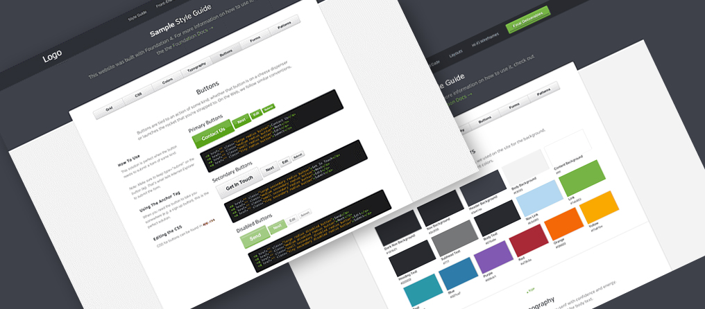
Sample Style Guide
Style guides, pattern libraries and UI kits
A style guide represents a book of rules created after all designs and functions are approved during the process of building your website, iOS or Android application. To achieve a consistent user interface, it is important to pay additional attention to documentation and collaboration between the designer and the developer. By making the style guide part of this process, it can be used to promote a shared vision, allowing the entire team to see the bigger picture, and to help the product meet requirements for consistency. Style guides come in different sizes and formats, so you may hear it called by different names such as UI kits, a pattern library, a living style guide, a static style guide etc. There are slight differences in each of these guide types, but what they all have in common are the general elements and rules they contain. Each focuses on design elements such as color, logos, fonts, icons, page or screen layouts, spacing, justification, common items, and correct usage for standard controls such as buttons, drop-down selections, radio button or check boxes. UI kits typically don’t contain actual code, but the living style guide goes to such lengths that it contains “living code”, or code which is constantly updated in the documentation to be in sync with the actual code. Once updated, this code is transformed into a format , which is compatible with any platform. This type of workflow allows designers to modify design tokens (categories such as text color, borders, font sizes, spacing etc.) without the necessity of reaching out to a developer directly to implement the changes. Outside of the living style guides, the most widely used style guide types are UI kits and pattern libraries, the later having many pre-built components written in HTML and CSS. There are many companies that place their style guides/ pattern libraries online, some examples are MailChimp, Salesforce, Uber and Starbucks.
When to use a style guide?
It may not always be necessary to develop a style guide as the time invested in one may be going overboard for small or simple projects. Typically, the use of a style guide is recommended in the following scenarios:
When your project is content heavy and has a lot of material that should be displayed in a myriad of ways.
If Your project is being updated on a regular basis with new features being frequently added, a style guide can help to keep the project organized.
When large teams are working on your project in addition to onboarding new team members. A style guide can be very useful at keeping the team on the same page, or accustoming new team members to the guidelines, when building onto components already created for a project.
Do different platforms means different styles?
Once a product experiences success on one platform, such as iOS, bringing that product to other platforms such as web, or Android, should be explored. But when expanding to new platforms, how can product consistency be ensured across each device? Web, iPhone and Android all have different approaches to UI and UX but you can certainly retain brand consistency or seek a balance by utilizing one of two approaches.
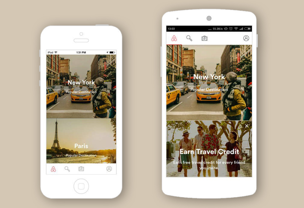
Airbnb UI on mobile devices
A brand oriented approach
A brand-oriented approach is the fastest option from a design perspective, but does have its downsides. A product that has native functionality in iOS, will be a custom implementation in Android, and therefore more complex from a development perspective. Also, with this approach you’ll have consistency in design but not within the user experience. For example, if your product is designed for the iOS environment and you transfer the same behavior to Android, then the Android user will not feel at home and you’ll be breaking the rules of a good user experience for those android users. There will be frustration and confusion because their expectations are not being met. In contrast, Instagram is an example of an app, which uses a brand-oriented approach and has retained brand consistency across iOS and Android with positive user adaptation to both platforms. A brand-oriented approach is best for uniquely designed interfaces that don’t follow any platform guidelines but are based on great UX that can make the project stand out and be accepted across all platforms.

Instagram UI on mobile devices
A mixed approach
A mixed approach lets you be brand oriented but at the same time, follow platform specifics. In order to successful implement a mixed approach, you have to figure out what UI elements make your product stand out and find platform specific solutions that won’t influence the brand identity. Some excellent examples are the Facebook app, Airbnb and Viber. Consistency with the brand identity is achieved by using brand colors, fonts and elements such as icons that are identical on all platforms. Here you can find basic differences between designing for iOS and Android.
Whatever approach you choose, keeping the interface similar or identical can be assured by following the rules set in the style guide. Make sure you specify what standards or rules are mandatory and which are flexible. A well thought out style guide that’s easy to use will be effective and will ensure your brand vision is kept safe even if your product is used across platforms.
Conclusion
To be effective, a style guide must not only contain good guidelines, but it must be used and accepted. To keep cross-platform consistency by having a successful style guide, make sure you produce it in a manner, which supports easy maintenance as documents produced in traditional formats can become stale and quickly outdated. Make sure everyone on your team knows how to use and interpret the guide so that they are actually using and maintaining it on a regular basis. When planning a style guide, consider what would make your style guide successful. Would it be ensuring the large-scale website you are creating has a consistent user experience? Or are you ensuring UI and UX consistency across all platforms? The construction of the style guide is used to create a shared design vision for the look and feel it documents, it contains the details of the design that must be followed. When a successful style guide is the central location for all design material and its creation is part of the process, the guide can help build consensus among the team. The end result is that all future updates or new features of the product are not only going to be consistent with your brand but you will have a great time management tool. When a style guide is done well, you will always know your goals and by keeping your promise to the end user you will receive positive feedback from a happy audience. Need advice on design for multiple platforms? Go ahead and reach out, our design team will be happy to help you out!
Lucija is FarShore’s Team Lead, managing team’s daily tasks and working on UI designs for all types of projects. Her interest in UI/UX, graphic communication and illustration has been evolving ever since the beginning of her secondary education at School of Applied Arts and Design. As a culmination of this interest, in March 2012 Lucija obtained Master degree in graphic technology at the Faculty of Graphic Arts in Zagreb.


