All too often, user flow on your website is a black-box that can seemingly only be optimized by a specialist for thousands of dollars. In order to demystify this process, below are three simple (even basic) things you can do very quickly to self-optimize.
1. A/B Test ALL DAY
No one knows your customers better than your customers do. And nothing supports changes like data supports changes. By pasting a tiny snippet of code inside your website’s HTML (any developer can do this in seconds) you can use a service like Optimizely, which allows you to change aspects of your site for certain users. Think that more potential customers might convert if you changed the image on the front page of your website? With Optimizely, you can test that by setting up an “experiment” in which a percentage of users see the new image and a percentage of users see the old image. Even better? You can change the criteria for a conversion in seconds. Want to get more people to purchase? You can track that. Want to have more user registrations? You can track that too.
2. Reality Check on User Flow
Regardless of the complexity of your website, many business owners fail to recognize a need for simplicity in the basic need to have a SIMPLE checkout process. Even if you have a simple checkout, there are likely simple changes that can be made to further simplify the process. Take Yumvelope, my e-commerce snacking service. Below is an illustration of the minimum checkout process any new order has to go through.
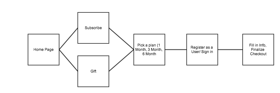
Seems simple, but each user has to visit at least 5 pages just to get started. A developer could simplify this process greatly with direction; for example, could the plan selection be made on the checkout page? Could registration be pushed to the final page?
By making this chart, you are forcing yourself to put yourself into the customer’s shoes, shoes which are all too often uncomfortable to walk in.
3. How does your Call to Action look?
This is deceivingly simple, but all too often ignored. How do users get to the checkout? On your home page, most if not all of the content on your site should link to the next step in your desired customer flow. Beyond linking, studies have shown that even just contrasting the color of the Call to Action with the rest of the page design can increase conversion exponentially.